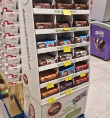
A GOOD MATCH MILKA & OREO
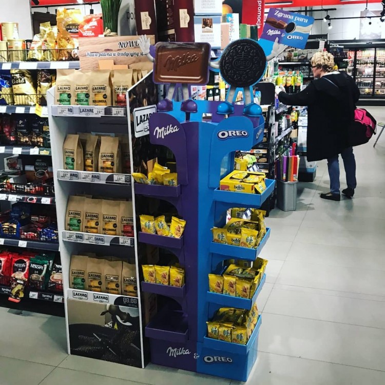
A cardboard display promoting two products. The structure and graphical design divides the stand in two parts. The violet side presents Milka products, whereas the blue one Oreo products. The topper has been visualized in an interesting way, a block of chocolate and an Oreo cookie in a friendly embrace hold a sign with the inscription: „A good match”. As we can see, the products sold so well that the empty shelves had to be filled with other brands.
Similar articles

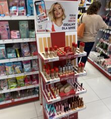
Cardboard display for cosmetics contains a tall back panel, on which four shelves have been installed.Each shelf has...

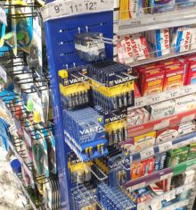
The narrow display for the battery has a structure made of metal. On the base of the display is placed a tall steel...

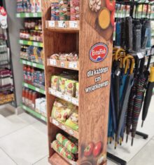
A simple, cardboard stand for meat products has a tall and narrow structure.The display consists of five shelves which,...

The tall stand made of cardboard has a simple but interesting construction. A major part consisting of seven rows of...
