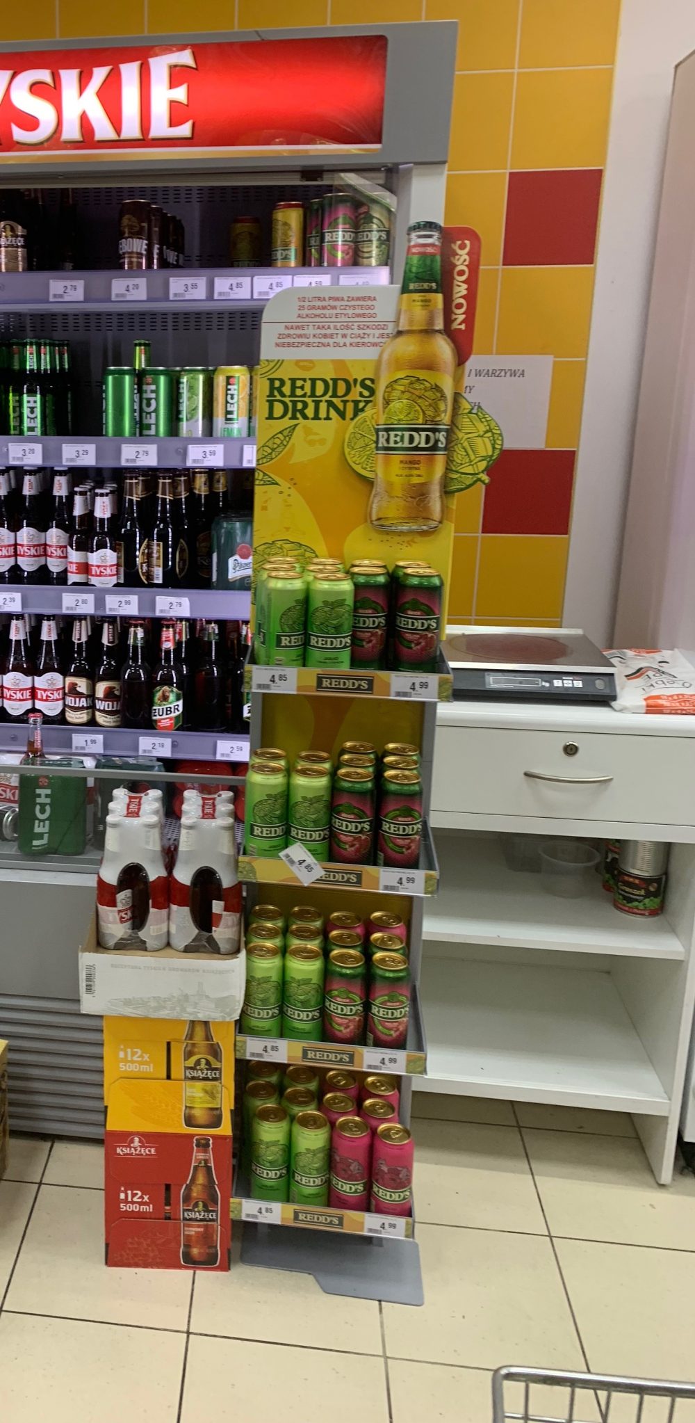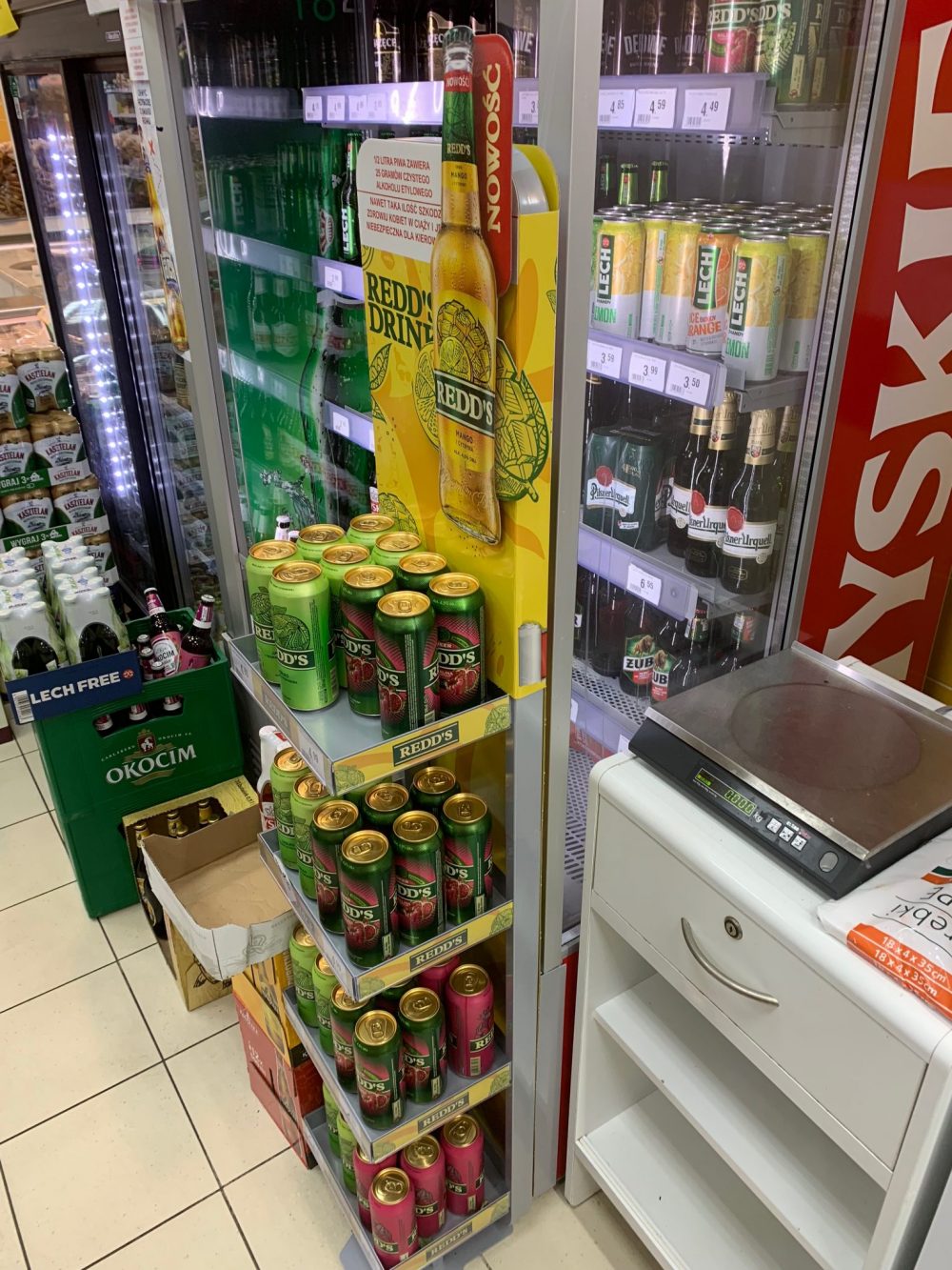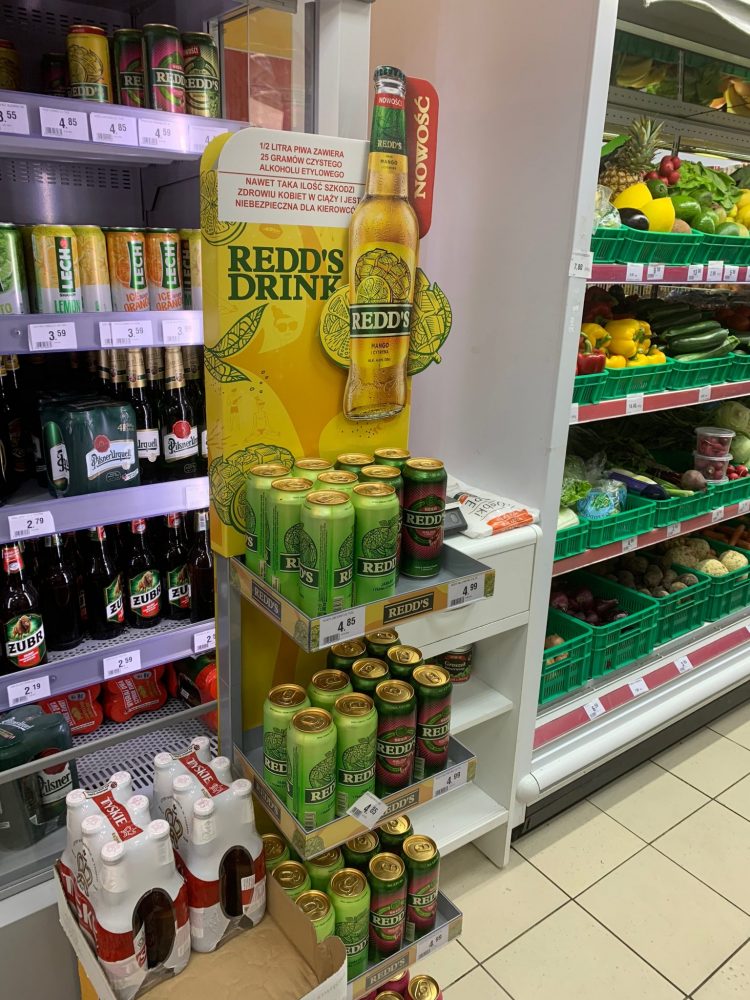
Redd’s
A new spring Redd’s exposition is focused on a new flavor added to a collection. Intensive colors and graphic design are hard to overlook even in crowded store.
The stand is based on metal frame with cardboard elements in a color scheme matched with the products. Four shelves are attached only to the back of the stand and it looks like an open, extended hand.
The high topper is impressive and distinguishes itself among the rest of the stock. This marketing strategy seems to be efficient because there is no new flavor beer left on the shelves.