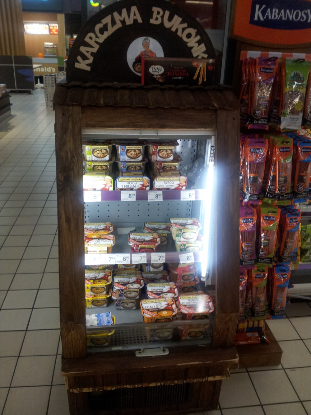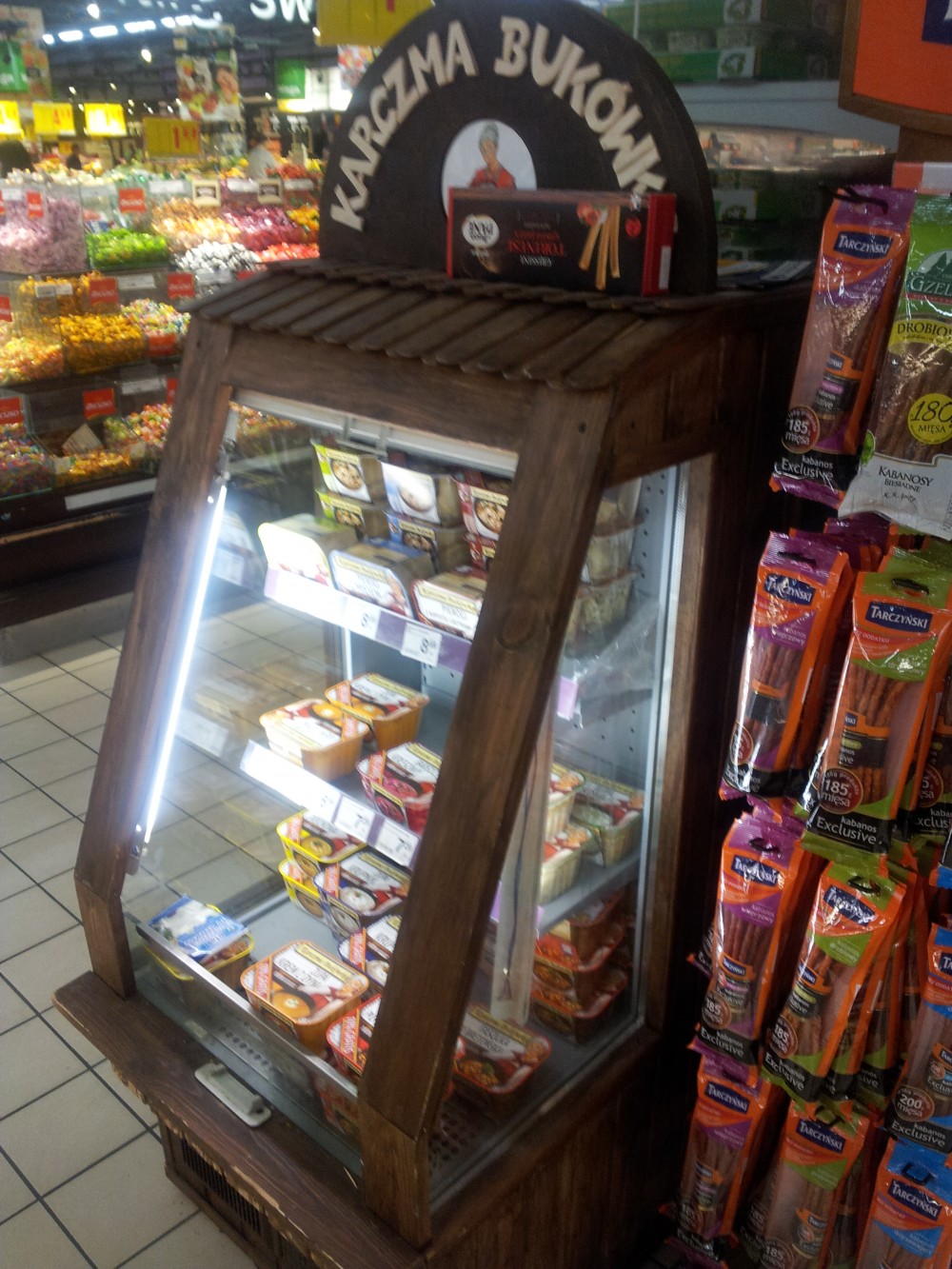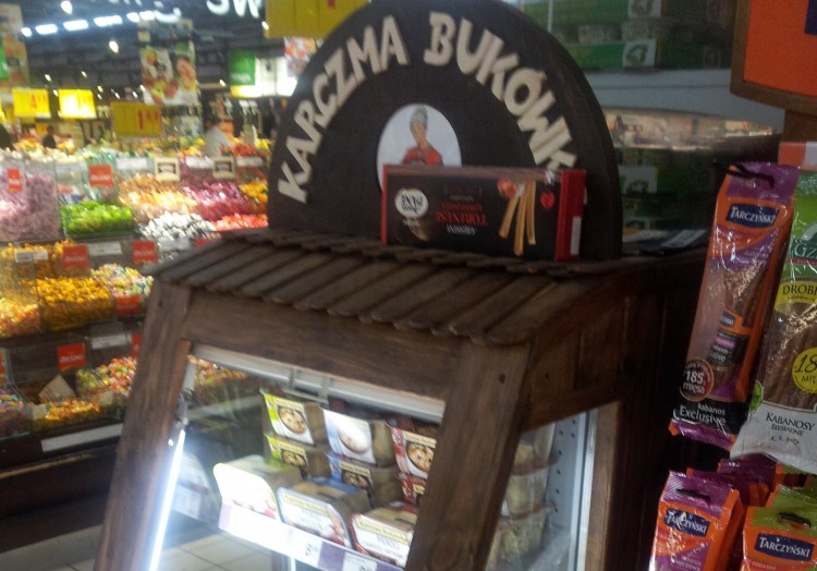
BUKÓWKA INN
In each grocery store there are dozens if not hundreds of alike products in similar prices. The choice of which one to buy is ours. It is however on the side of the producer whether their offer will stand out, attract the customer and so, increase the probability that they will choose their products.
Bukówka Inn has chosen association with nature and traditional home cuisine. And it is seen at a first glance, from the wooden delicatessen refrigerator to the artwork – an important element of which is an elderly lady, probably meant to be associated with a cooking grandma. The offer includes simple dishes, known and loved by Poles for years – pierogi, soups, baked beans.
The packaging is simple, functional and limited in the color amount. The plastic boxes allow the first visual rating of the meal’s attractiveness. In it there are paper trims, whose main artwork, apart from the name, is a photo of a plate wit a meal and the Bukówka Inn logo.
This seemingly humble form is well thought-out. It does not distract the customer with unnecessary information – it is meant to be associated with home, traditional and natural cuisine, that everybody remembers from their childhood. Many will pick the dishes out of curiosity, and others because of nostalgia for the trouble-free years of childhood and youth.